

Colour Isn’t Decoration. It’s Strategy
What a colour-matched outfit (and a very practical drink bottle) reveals about brands.
First published February 9, 2026
At first, it seemed so innocent.
It was an unassuming Thursday.
I had a couple of online meetings, some brand development work, kid-drops at a holiday programme or two.
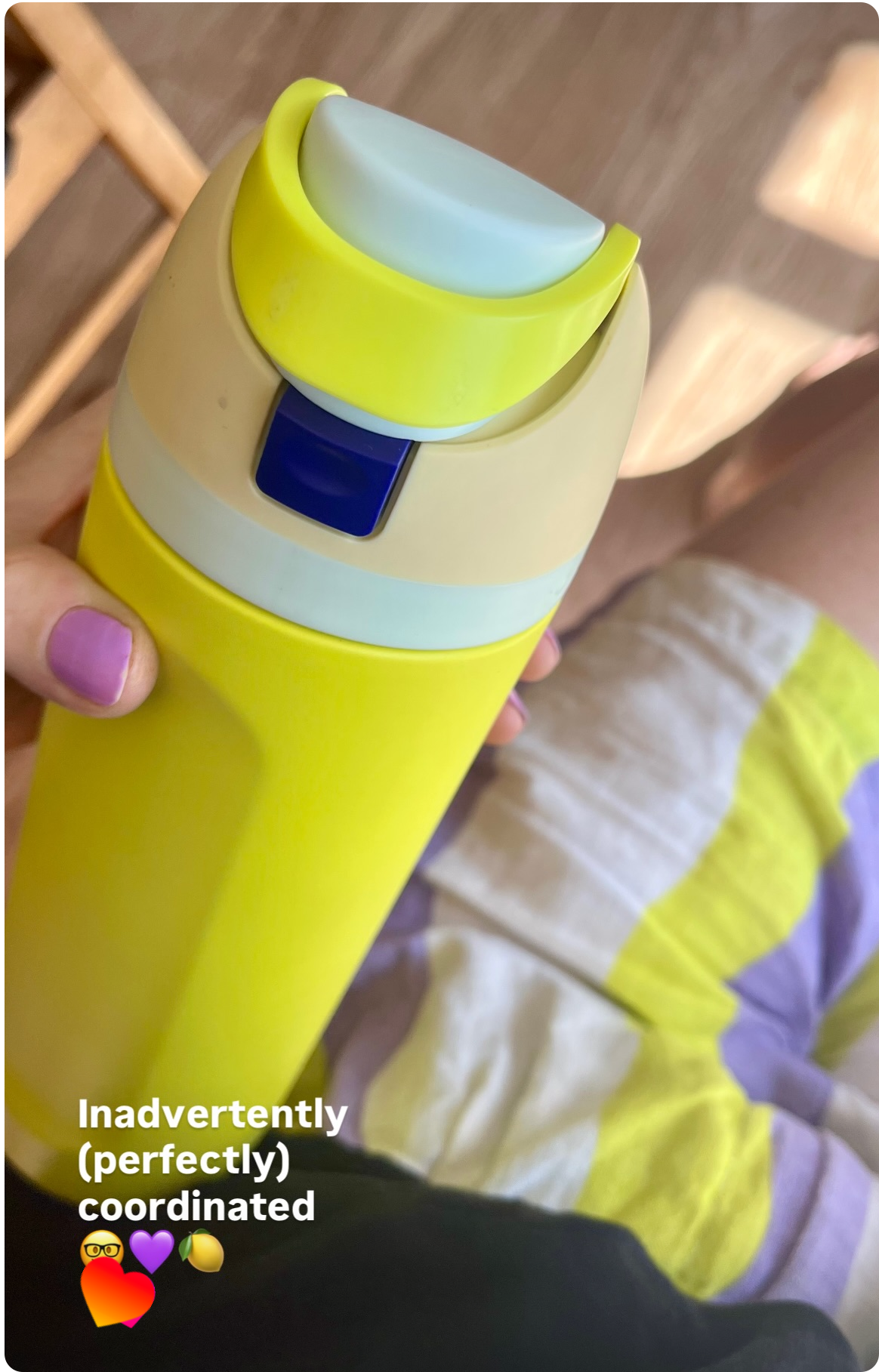
Clad in a black breezy shirt (mature, functional), colour-pop lime yellow/lilac shorts (and lilac nails, ‘cause why not)—I was ready for the day.
Day-appropriate, with a dash of dopamine.
That’s when I noticed my new, very handsome, very practical drink bottle (Owala, since we’re here) was almost impeccably colour-matched to my outfit. The joy of it!
Now, if you’re thinking this was a happy coincidence—or depending on your wardrobe preferences, problematic—you might be right. At first, I chalked it up to that, too.
And being a colour lover, I snapped a pic and dropped it on IG stories. Proceeded to go about my day, and didn’t think much more of it.
Then came Friday.
Bright and sunny, perfect for a quick run before work. Then, thirsty back at home, I reached for my bottle and—alas.
Again. The matchy-matchy.
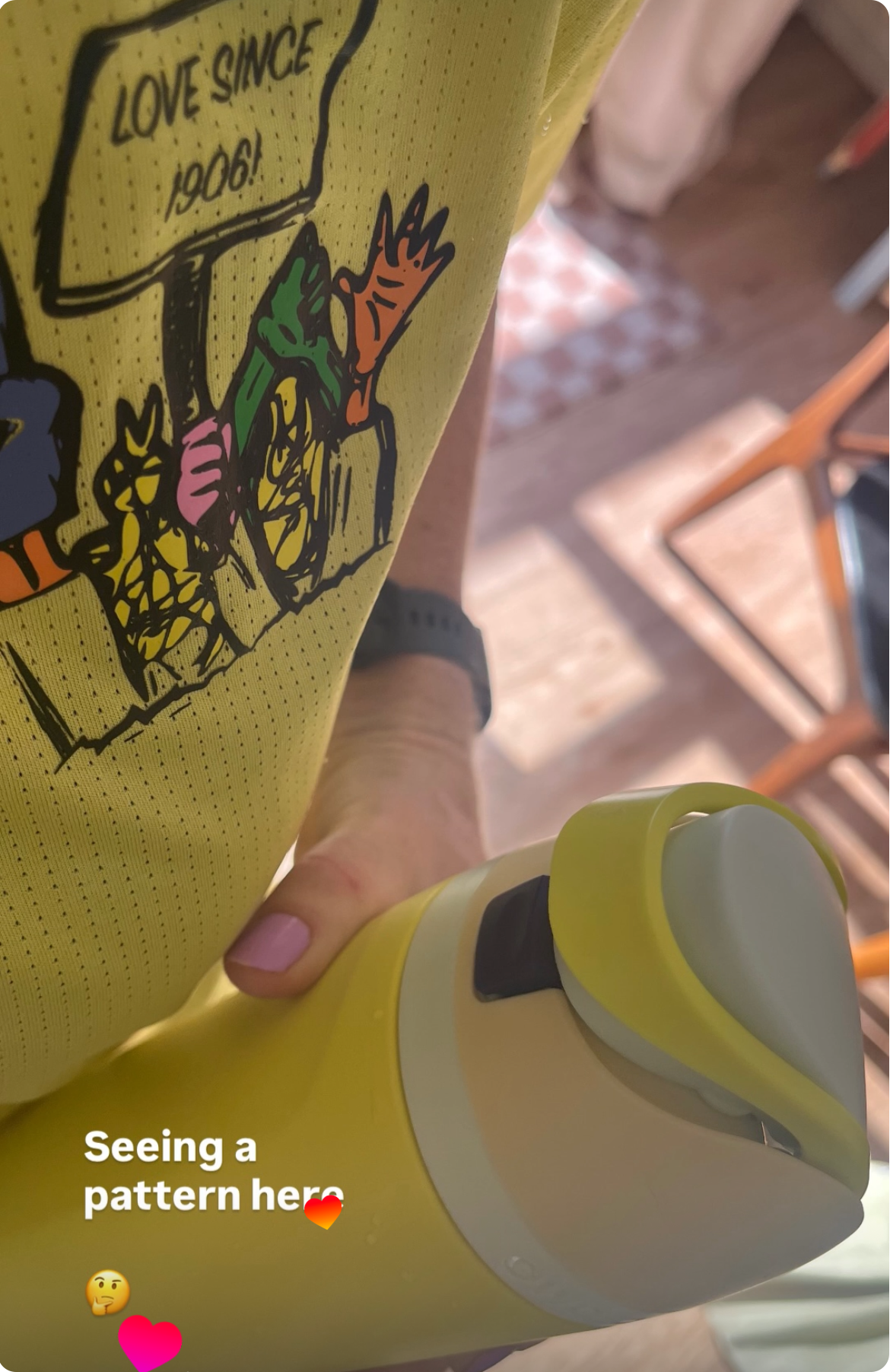
Lime yellow tee, chest print accented with dark blue and lilac. Lilac nails still hanging in there. What once felt like fun serendipity now felt… suspicious?
Now, as you may well be aware, I have a long history with yellow. And if it were my standard sunny-yellow of choice, sure. There might not be cause for question.
But this was a different limey hue altogether. Like chalk and cheese to a designer! “Not your usual yellow,” as my son put it.
Still oddly delighted, I snapped another pic and shared it.
But by then, my brand-brain was fully engaged.
So. What was going on?
Happy accident #2… or something deeper?
Colour psychology plays a powerful role in branding and design.
Over many (many) moons working with brands myself, I’ve seen firsthand how colour shapes perception, behaviour, and trust.
This is not new—design pioneers and modern legends have expressed this often.
Paul Rand contributed to the transformation of a corporate landscape with his strategic simplicity in colour and visual design. Best known for his iconic work for IBM, UPS and ABC, he viewed colour as a non-negotiable ingredient for functional, psychological and emotionally resonant design.
Present day brand legend Jessica Walsh of New York Agency &Walsh, demonstrates how colour can “make or break” your brand.
But what’s a colour-matched drink bottle got to do with branding?
In one early career moment, a Creative Director asked me to refine a brand colour palette:
“You’re good with colour, right?”
“Yes, sure!” (Inner monologue: aren’t all designers?)
But the approach I've honed over my 20 years (🤓) in brand since then then—is this:
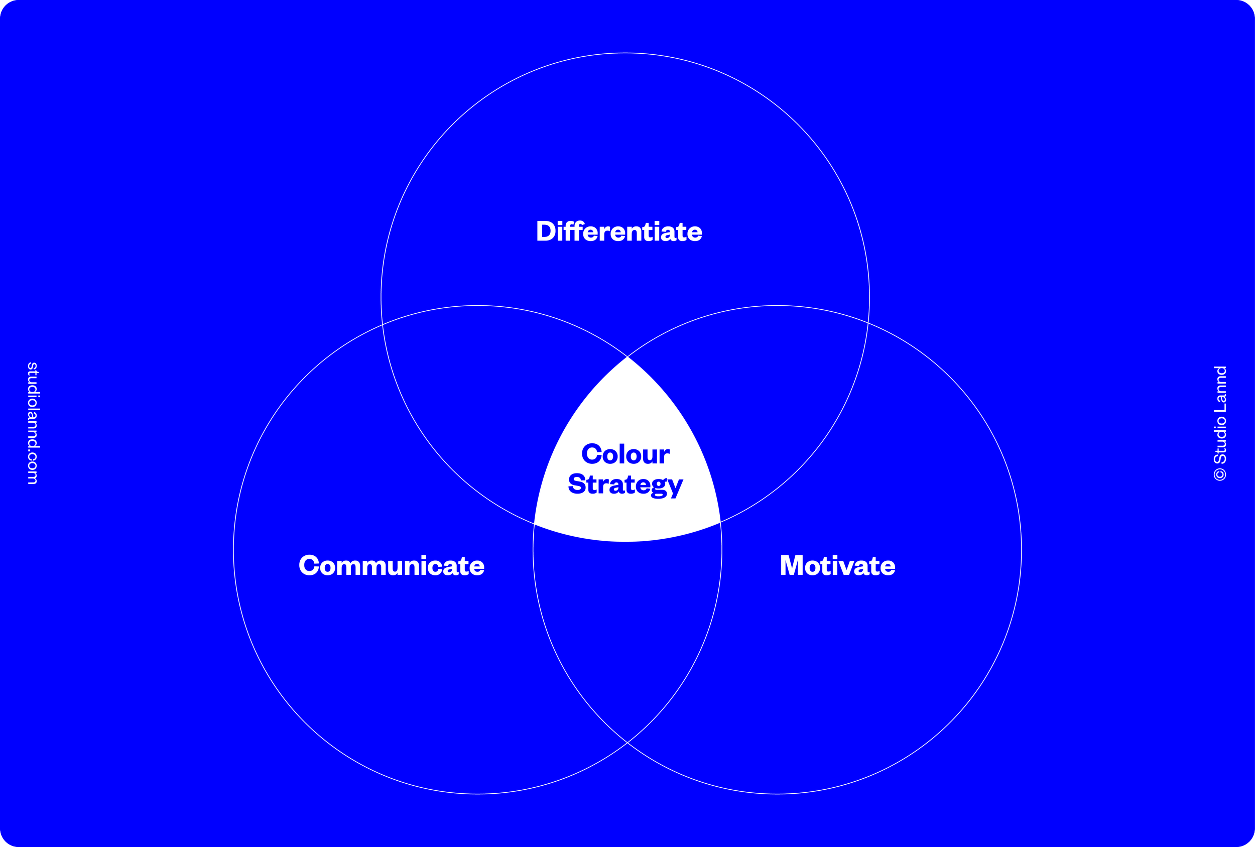
Colour has three critical jobs in branding. Individually important, but most powerful when they work together.
Differentiate + Motivate + Communicate =
Colour Strategy
To illustrate, let's imagine a power-tool brand repositioning itself:
Differentiate—What’s everyone else in your category doing?
Your visual strategy leg-up to standing out—on shelf, on site, and online. Are you operating in a pool of same-ish dark coloured power brands? While a playful palette’s probably not right, we can still convey safety and efficiency—and stand out with clever colour use.
Motivate—What energy are you projecting?
Your brands personality, tone and values—the emotional superhighway connecting your brand to your audience. A palette full of bright, playful pastels? Likely not the right fit for a brand selling power, efficiency, and safety.
Communicate—Function matters.
Contrast, legibility and colour pairings that grab attention in crowded rooms and lives. To immediately pass on your message, pass accessibility tests (high enough contrast messages people can actually read) and work across your brand touchpoints, everywhere. Because if people can’t read or understand it… what’s the point?
So. Was it pure happy coincidence?
After writing this, I’m leaning… no.
And honestly? My outfit and bottle match might’ve ticked all three boxes.
Differentiate: self-expression. We signal who we are before we say a word.
Motivate: colour affects moods—especially when the day feels grey.
Communicate: bright colour for festivals + fun; darker or neutrals for more serious rooms.
(And a fourth, subconsciously annoyingly strategic..?)
If this hits close to home, save it—for your brand, or your ‘fits.
Because next time you get dressed “without thinking,” you might realise it’s not accidental at all.
First published February 2026.
This content is for general information only and not intended as specific advice.